

Understanding Colour Psychology
Why: Colours can trigger psychological responses and influence how people perceive your brand.
How: Different colours evoke different emotions and associations. For example:
- Red: Passion, excitement, and urgency.
- Blue: Trust, calmness, and professionalism.
- Green: Growth, health, and harmony.
- Yellow: Optimism, happiness, and energy.
- Black: Sophistication, luxury, and elegance.
Consider Your Target Audience
Why: Different colours appeal to different demographics and cultural backgrounds.
How: Research your target audience’s preferences and cultural associations with colours. For example, younger audiences may be drawn to bright and playful colours, while a more mature demographic might prefer classic and understated shades.

Study Your Competitors
Why: Understanding the colour choices of competitors can help you differentiate your brand.
How: Analyse the colour palettes of competitors in your industry. Choose colours that set you apart while still aligning with industry standards. For instance, if your competitors predominantly use blue, you might consider a unique accent colour to stand out.
Create a Balanced Colour Palette
Why: A balanced colour palette ensures visual harmony and enhances brand recognition.
How: Typically, a brand palette consists of primary, secondary, and accent colours:
- Primary Colours: The main colours that represent your brand.
- Secondary Colours: Complementary colours used to support the primary palette.
- Accent Colours: Used sparingly for emphasis and to add visual interest.
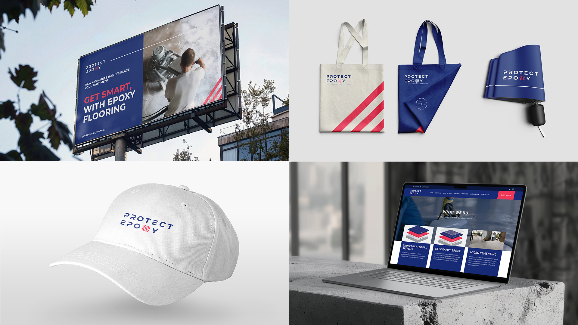
Test Your Palette Across Mediums
Why: Colours can appear differently on various platforms and materials.
How: Test your colour palette in different contexts, such as print, digital, and physical products, to ensure consistency and effectiveness. Adjust as necessary to maintain your brand’s visual impact.

Ready to find the perfect colours for your brand?
Contact Novu Creative today and let’s craft a colour palette that truly represents your brand’s essence.